

Visualizing Sequence of Returns Risk: A 3-D Map
Visualizing Sequence of Returns Risk: A 3-D Map
Mar 25, 2021 / By Craig L. Israelsen, PhD
See in 3-D how an account starting with a million dollars would have fared over rolling 25-year periods from 1926 to present—as well as annual withdrawal fluctuation over those years. Plus a comparison of the best 25-year period and the worst 25-year period for investors.

Sequence of returns risk (or more correctly sequence of returns variability) is typically defined as a situation where a retiree (or anyone systematically withdrawing money from a portfolio) experiences several years of poor portfolio returns which, combined with their withdrawals from the portfolio, harms the potential longevity of the portfolio and/or reduces the amount of money they are able to withdraw from the portfolio. In short, a bad start may lead to reduced annual withdrawals and even early portfolio failure.
There is a solution to the fear of running out of money: only withdraw a certain percentage of the portfolio’s value at the end of each year. For example, a withdrawal of 4% or 5% of the portfolio’s value in January of each year. It is not possible to deplete a portfolio (regardless of the asset allocation) using this method because the annual withdrawal will fluctuate each year based on the portfolio’s performance the prior year.
If the performance was bad (e.g., a bad sequence-of-returns) the next withdrawal will be smaller than the withdrawal in the previous year. This is actually a helpful self-protecting mechanism built into a portfolio withdrawal that is percentage-based. But, it does mean the retiree will need to get by with a reduction in their retirement income during some years. This is the price of protecting a portfolio from early ruin.
Of course, if a retirement portfolio is invested recklessly it can fail prematurely. The analysis here assumes a reasonable and prudent retirement portfolio asset allocation, such as 50–60% in a variety of equity asset classes and the balance in stable fixed income asset classes.
When does the sequence of returns risk (SORR) manifest itself? Where SORR impacts a retiree is in the fluctuation of annual withdrawals and the growth or decline of the retirement portfolio over time. In this sense, SORR is simply a fancy title for variability in the performance of the portfolio. If there are several years of poor returns (such as what we witnessed in equity markets from 2000–2002) a retiree using a percentage-based withdrawal system will have three years in a row with reduced annual withdrawals (assuming they have a portfolio largely invested in equities).
This poor sequence of returns negatively impacts their retirement income for several years. Moreover, if the portfolio losses are significant, the growth of the portfolio 25–30 years down the road will likely be reduced. Thus, when employing a %-based withdrawal system, SORR has the potential to negatively impact the amount of retirement income available to a retiree in some years AND reduce the growth potential of a retirement portfolio.
Figure 1 illustrates the variability in annual withdrawals from a retirement portfolio based on a 4% withdrawal rate over rolling 25-year periods. That is, 4% of the portfolio’s ending account value is withdrawn each year. The starting balance of the retirement portfolio was assumed to be $1 million and the asset allocation was 40% large cap U.S. stock, 20% small cap U.S. stock, 30% U.S. aggregate bonds and 10% cash. The first year’s withdrawal was $40,000 (4%) and each subsequent withdrawal was 4% of the portfolio’s year-end value. Annual rebalancing was assumed. The impact of inflation and taxes were not explicitly considered.
Figure 1 is a 3-D visual map of 25 annual withdrawals across 71 rolling 25-year periods from 1926–2020. The withdrawal in year one of each rolling 25-year period is on the front edge of the graph and the withdrawal in year 25 is against the back wall of the graph. The first 25-year period of withdrawals (which simulates a retiree withdrawing money from age 65–89) was from 1926–1950, at the far left edge of the graph. The second was from 1927–1951, and so on.
The lake-blue portions of each graph that appear sunken indicate when the withdrawals in years two through 25 declined below the starting withdrawal of $40,000. There were other years in which the annual withdrawal declined, but not below the starting balance of $40,000. The pink line superimposed onto Figure 1 denotes the 25-year period from 1975–1999, which had a particularly good sequence of returns. The purple line indicates the less desirable sequence of returns from 1996–2020.
Figure 1: Annual Withdrawal Fluctuation Over 25-Year Periods60% Equity/40% Fixed Income Portfolio
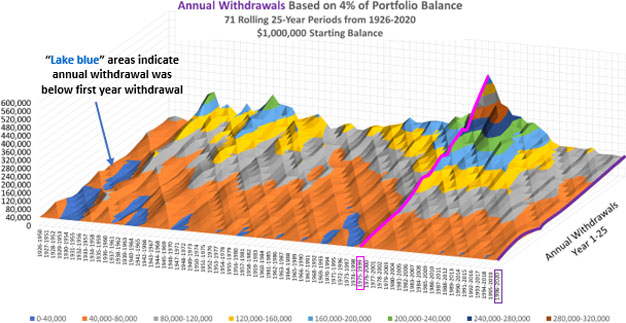
Source: Craig Israelsen, PhD
Figure 2: Retirement Portfolio Balance Fluctuation Over 25-Year Periods60% Equity/40% Fixed Income Portfolio
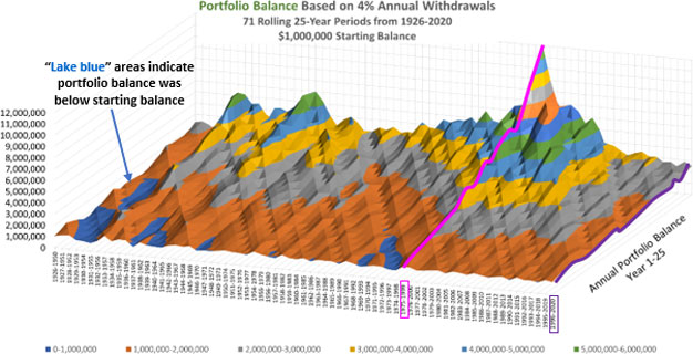
Source: Craig Israelsen, PhD
The average annual withdrawal during the 1975–1999 period was $173,822—which represents the power of an ideal sequence of returns (pink line in Figure 1). Conversely, the 25-year period from 1996–2020 (purple line in Figure 1) had a less than ideal sequence of returns, which resulted in an average annual withdrawal of only $63,649.
On average, the annual withdrawal declined year-over-year 35% of the time (over 71 rolling 25-year periods) in this 60% equity/40% fixed income retirement portfolio (assuming a 4% withdrawal rate each year). The average decline in the years in which the withdrawal declined was $5,807 (assuming a starting balance of $1,000,000). That outcome, however, needs context.
The average annual withdrawal over the 71 rolling 25-year periods was $90,701, which is well above the first year withdrawal of $40,000—precisely because the portfolio balance was growing over time (albeit at different rates due to the various sequence of returns being experienced). Thus, even though a 4% withdrawal resulted in a reduced annual withdrawal roughly one-third of the time, the average dollar amount of the decline is a relatively small percentage of the average withdrawal. Moreover, on the flipside, the annual withdrawal increased year-over-year 65% of the time by an average of $11,176. We see this visually in the general contour of the 3D graph as it moves upward toward the back wall.
Figure 2 depicts the fluctuation in the growth of the retirement portfolio account balance over the same 71 rolling 25-year periods (assuming a 4% withdrawal rate). The lake-blue portions of the graph depict when the end-of-year portfolio balance dipped below the starting balance of $1,000,000—which was infrequent. However, it does demonstrate sequence of returns risk.
Some of the 25-year periods started out badly, such as the 1929–1953 period. The ugly sequence of returns risk during the great depression caused the portfolio balance to dip below the starting balance. By the end of 1932, the portfolio balance was $435,055, but by 1953 the portfolio balance had recovered to over $1.66 million. Having weathered the sequence of returns storm, the retiree’s portfolio was not destroyed because they didn’t bail out of their 60/40 asset allocation. The power of staying with it is hard to overstate.
The pink line in Figure 2 represents the growth of the $1,000,000 retirement portfolio during the ideal 25-year period from 1975–1999. The mountain peak is the portfolio’s balance of nearly $12 million at the end of 1999.
This particular 25-year period was perfectly sandwiched in time so as to avoid the equity meltdown years of 1973-74 and the tech wreck from 2000–2002. Conversely, the 25-year period from 1996–2020 in Figure 2 (purple line) was a less-than-ideal sequence of returns and resulted in an ending account balance of over $2.5 million.
See Table 1 below for a summary of the year-to-year withdrawals and annual growth of the portfolio during both of these specific 25-year periods (1975–1999 and 1996–2020). Overall, these results should be highly encouraging because we observe that even a sub-optimal sequence of returns (1996–2020) resulted in the retirement portfolio growing over time despite the retiree withdrawing just under $1.6 million in total over the 25-year period. It’s almost hard to believe: start with $1 million, withdraw nearly $1.6 million, and finish with just over $2.5 million—all of this during a less than optimal sequence of returns.
In summary, sequence-of-returns risk is really nothing more than performance variability…and it is a reality we all face as investors. As the graphs illustrate, sequence of returns storms are to be expected along the way. We have to weather them.
The greater risk is allowing a bad sequence of returns deter clients from sticking with a sound investment and retirement plan. Hopefully these 3-D maps illustrate that a lake early on doesn’t mean we won’t climb a peak later.
Table 1: 2 Different Sequences of Returns: 1975–1999 and 1996–202060% Equity/40% Fixed Income Portfolio
$1,000,000 starting balance
4% of portfolio balance annual withdrawals
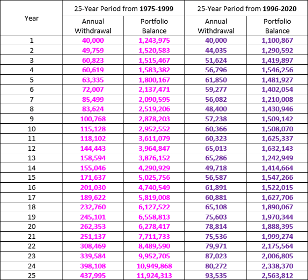
Source: Craig Israelsen, PhD